The Flexbox
Get ready…this is the best part of CSS! Flexbox & their cheat sheet


What is Flexbox model CSS and Why we are using this?
The Flexible Box Module, usually referred to as flexbox, was designed as a one-dimensional layout model, and as a method that could offer space distribution between items in an interface and powerful alignment capabilities. and also we want to apply the flexbox property then it is mandatory to apply the display: flex; property. Flexbox gives the container the ability to expand and Shrink elements based on the available space on your browser screen. Flexbox Layout replaces float Layout Design with one-Dimensional layouts.
Flex properties
When we apply a flex property to the container then all the child items move in a row.
flex-container
.container{
  display: flex;
}
Flex-Direction
Flexbox applied on two axes main & cross axis. The property flex-direction is used on the container and includes four options: row, row-reverse, column, and column-reverse, where row is the default. This will determine the order in which elements will be displayed and the direction of the layout
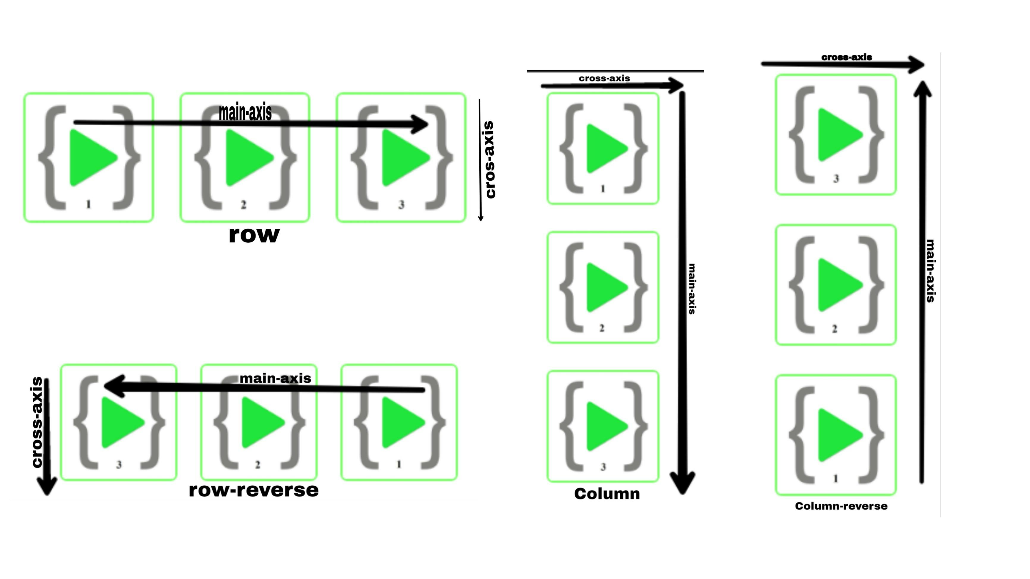
- Row (default)-
When we apply the
display: flexproperty then all the children's direction is row and the default flex-direction is also row. and it is direction is left to right in ltr and direction is right to left in rlt.
.container{
    display: flex;
    flex-direction: row;
             }
- Row-Reverse-
When we apply
flex-direction: row-reverse;then the whole row of containers and their items float reverse direction. it is right to left in ltr; left to right in rtl.
.container{
    display: flex;
    flex-direction: row-reverse;
}
- Column-
When we apply
flex-direction: column;it is the same as the row but the direction is top to bottom.
.container{
    display: flex;
    flex-direction: column;
}
- Column-Reverse-
applying the
flex-direction: column-reverse;property is the same as row-revers and the row direction is bottom to top.
.container{
    display: flex;
     flex-direction: column-reverse;
}
Flex-wrap
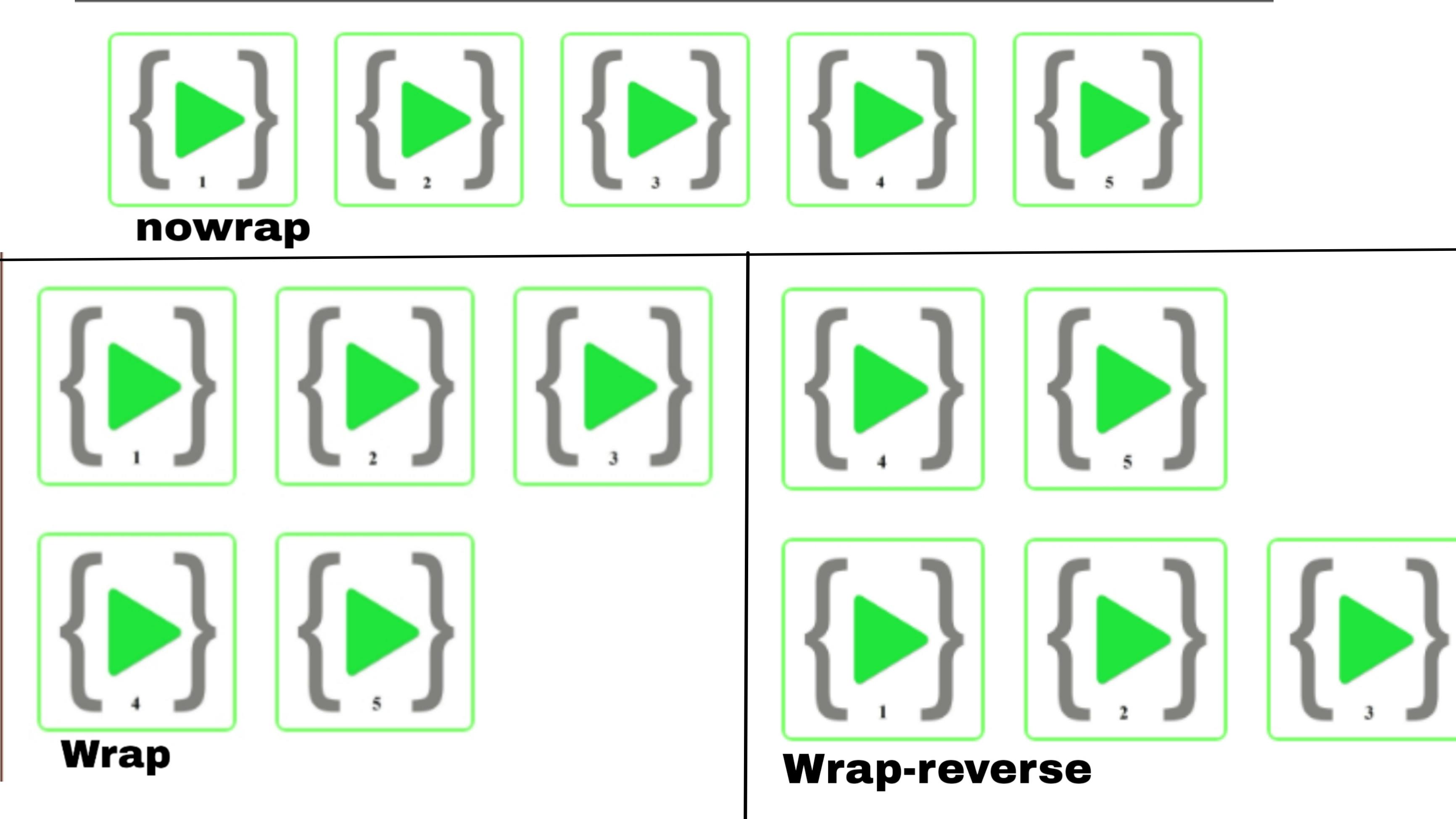
In default flexbox property tries to all content in one line but when we apply the content wrap property by using the flex-wrap property. all content will be wrapped in their container. The flex-wrap property can take any of the following values
- nowrap- This is the default property. All the items will be placed on one line following the main axis.
.container{
    display: flex;
    flex-wrap: nowrap;
}
- wrap- terms will wrap from top to bottom.
.container{
    display: flex;
    flex-wrap: wrap;
}
- wrap-reverse - Items will wrap from bottom to top.
.container{
    display: flex;
    flex-wrap: wrap-reverse;
}
by adding a row, column, or wrap we can alter the sequence in which elements are displayed. if we want to move a specific element in a particular sequence individually, we can use order. the property takes a default integer is 0. if the other elements assign 1. and all others are set to the default 0, it will appear at the end. If assigned a -1, the element will appear at the beginning.
Justify-Content
The element position is defined by their main axis, we can use justify-content on the container. and apply the values as follows:
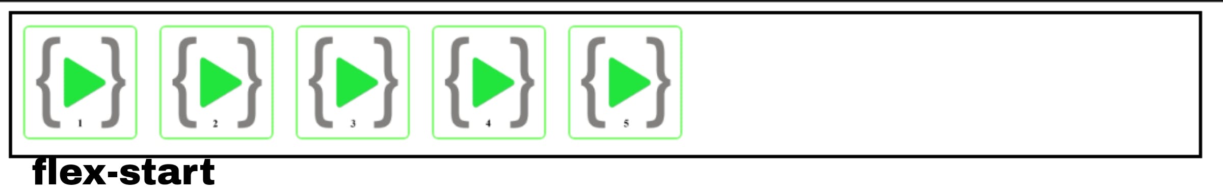
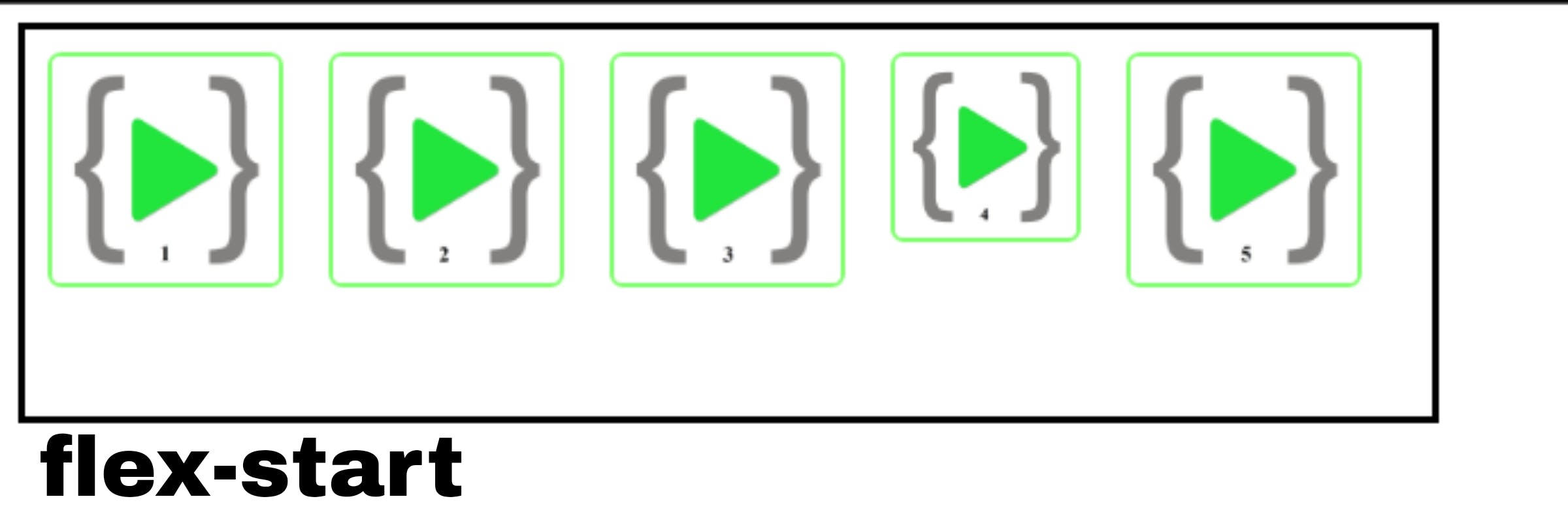
- flex-start – flex-start is the default value. The Element is in a container placed at the beginning of the container.
.container{
    display: flex;
    justify-content: flex-start;
}
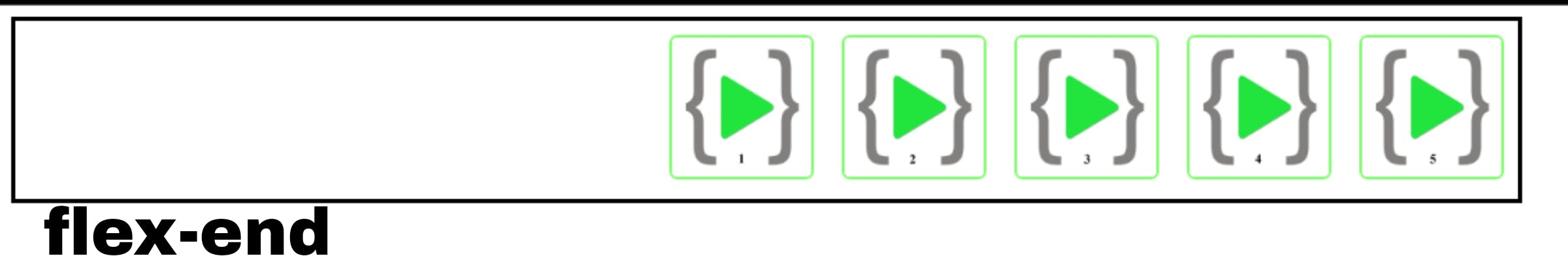
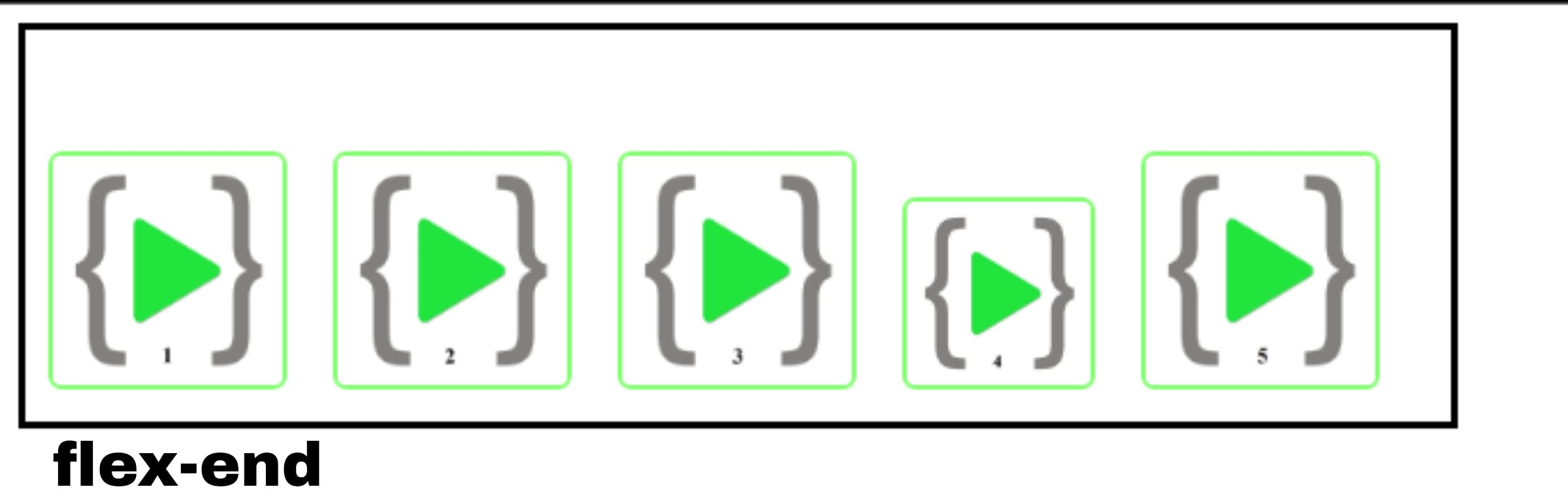
- flex-end –Elements are placed at the end of the container.
.container{
    display: flex;
    justify-content: flex-end;
}
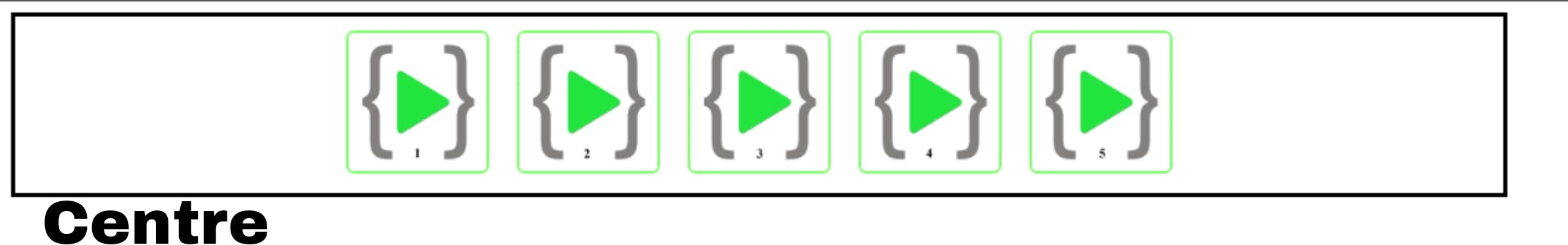
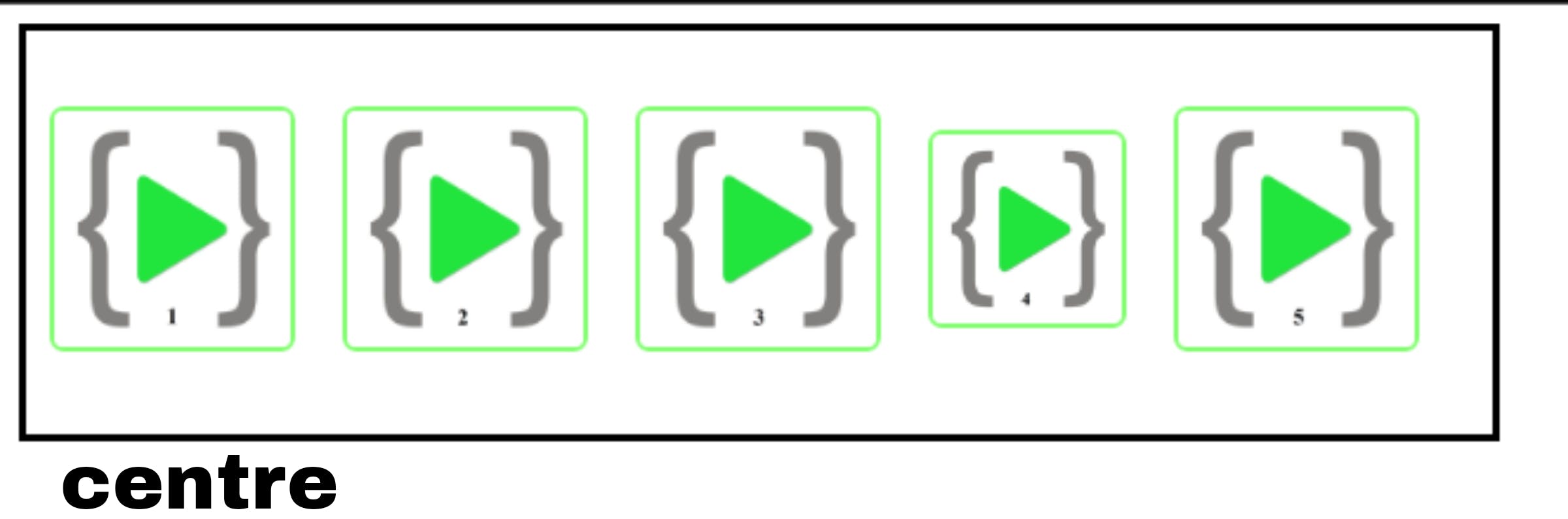
- center – Elements are placed at the center of the container.
.container{
    display: flex;
    justify-content: center;
}
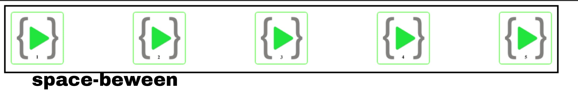
- space-between – Elements are spaced evenly across the container with no space between the edges of the container and the first and the last items.
.container{
    display: flex;
    justify-content: space-between;
}
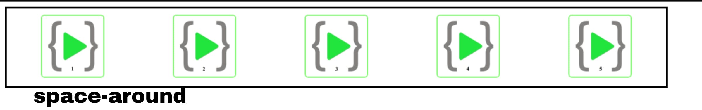
- space-around – Elements are spaced equal to the edges of the container and the. space is evenly in between the elements.
.container{
    display: flex;
    justify-content: space-around;
}
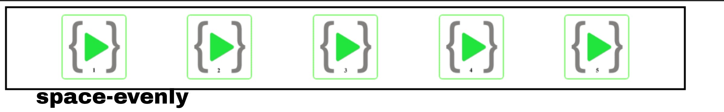
- space-evenly – Elements are spaced evenly across the container with the same amount of space between the edges and the fist and last element and between the elements.
.container{
    display: flex;
    justify-content: space-evenly;
}
Align-Items
The default axis of the flexbox is the main axis and align items applied to the cross-axis are perpendicular to the main axis. and apply the values as follows:
- flex-start - This property applies to the flex container and its elements placed at the start of the container.
.container{
    display: flex;
    align-items: flex-start;
}
- flex-end - This property applies to the flex container and its elements are placed at the end of the container.
.container{
    display: flex;
    align-items: flex-end;
}
- center - This property applies to the flex container and its elements are centered on the container or cross-axis
.container{
    display: flex;
    align-items: center;
}
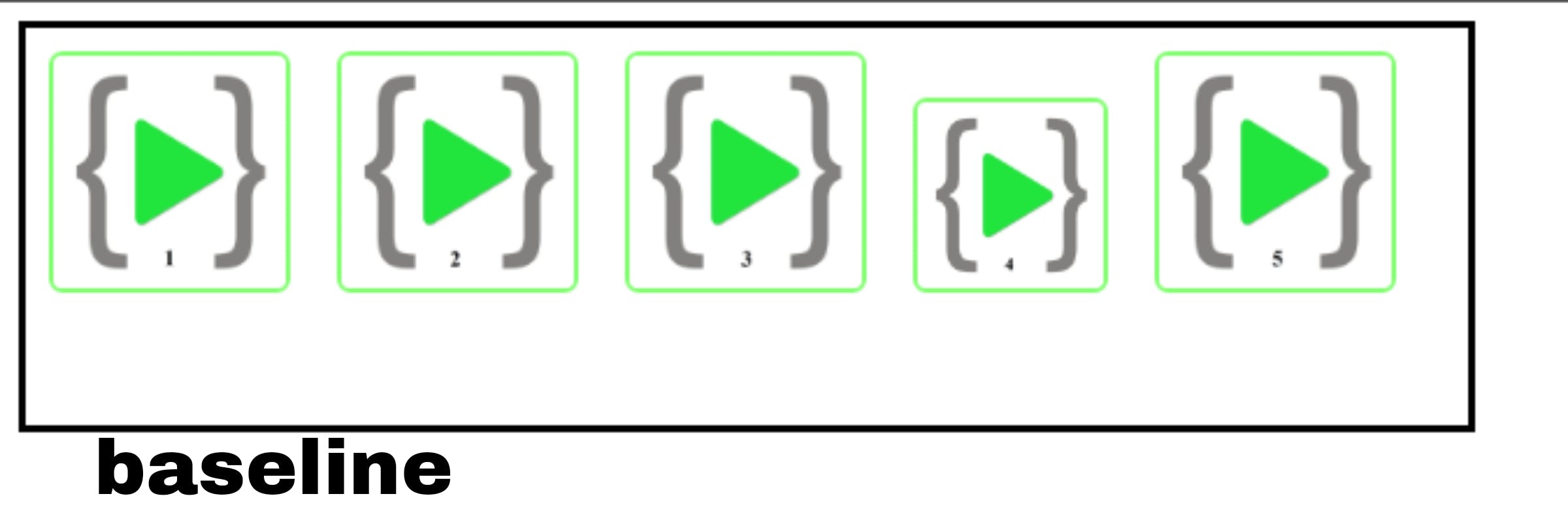
- baseline - This property applies to the flex container and its elements are aligned such as their baselines align
.container{
    display: flex;
    align-items: baseline;
}