Input Elements
Unleashing the Power of HTML Input Elements: Enhance Your Forms with Style and Functionality!
In HTML, the <input> element creates form controls that allow users to enter data. This element is used within the <form> element to declare input fields. The type of input field can be specified using the "type" attribute, which can take various values depending on the desired input type.
Syntax :
<input type = "text" />
Attributes used in input element :
type: In the
typeattribute works varies considerably depending on the value of itstypeattribute.value: The
valueattribute is used to specify the value of the input element.name: The name attribute is used to specify the name of the input element.
placeholder: The
placeholderattribute is used to hint or inform the user about what value fill to the input field.alt: The
altattribute is provide alternative text to the user when image is not load.autofocus: The
autofocusattribute is used to when page is load the element should automaticaly focus.checked: The
checkedattribute is specifies that the element should be pre-selected(checked) when the page is load.disable: The
disableattribute is used to automatically disable element or when some condition will be met.form: The
formattribute is used to when one or more forms to which the input element belongs to.required: The
requiredattribute specifies the input filed must be filled out before submitting the form.readonly: The
readonlyattribute specifies the input filed is only-read and read only input field cannot be modified.accept: The
acceptattribute is used to specifies the types of files that the server accepts.autocomplete: The
autocompleteattribute is specifies to when input element is enable auto complete then it will used to complete input field.formaction: The
formactionattribute is used to specifies the URL of the file that will process the input control when the form is submitted(fortype = "submit").formtarget: This property is used to specifies where to display the response that is received after submitting the form (for
type=”submit” and type=”image”).maxlength: The
maxlengthattribute is used to specified the maximum number of character is allowed in an<input>element.src: The
srcattribute is used to specified the URL of the image to used as a submit button (only fortype = "image").
The following types are available for the type attribute:
button: A button with no default behavior displaying the value of the value attribute, empty by default.
checkbox: A checkbox allowing single values to be selected or deselcted.
color: A color box is used to opening a color picker when active in supporting browsers.
date: A control dor entering a date in the year, months and day format. when click the date box then open the date picker and select date.
email: A field for entering email address. It looks like a text input but has validation parameters and relavent keyboard in supporting browsers.
file: A file is select by the user using this type file attribute and using accept attribute to define the file type of the files control can select.
hidden: when type is hidden then the element not display but there value is submitted to the server.
image: It is graphical submit button. display image defined by the src attribute. the alt attribute displayed it the image src is missing.
number: A control for entering a number and that input field only number will be add.
password: A single-line text field whose value is obscured. Will alert user if site is not secure.
radio: A radio button allowing a single value to selected out of multiple choice with the same name value.
range: A control for entering a number whose exact min to max value will be define the range
reset: A button that resets the contents of the form to default values. Not recommended.
submit: A button that submits the form.
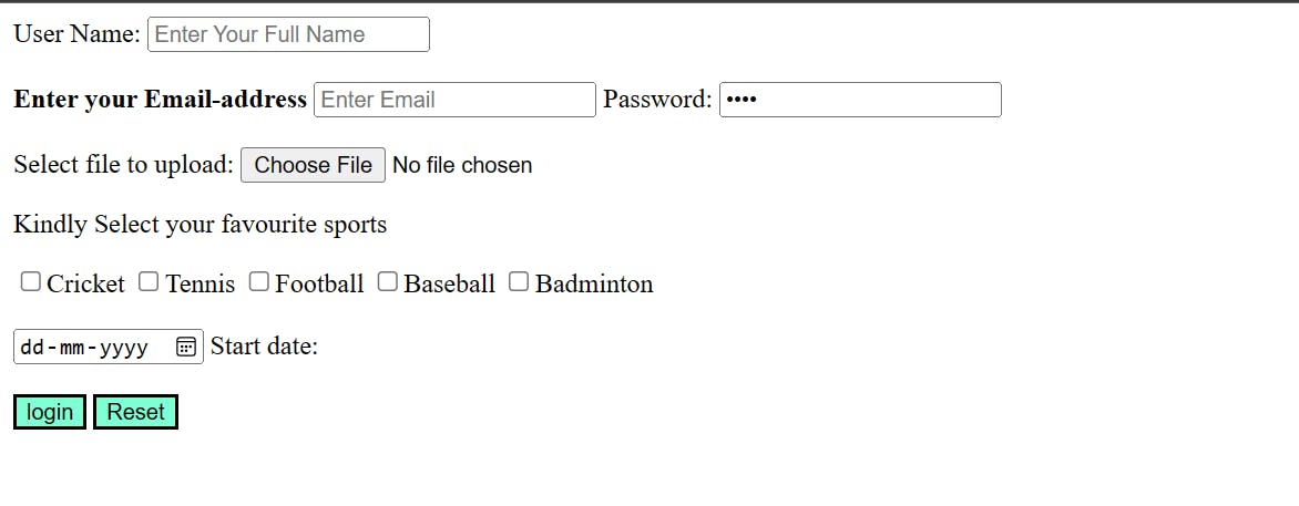
Example :
<!DOCTYPE html>
<html lang="en">
  <head>
    <title>HTML Input Element</title>
  </head>
  <body>
    <form>
      <label>User Name: </label>
      <input
        type="text"
        name="user-name"
        placeholder="Enter Your Full Name"
      /><br /><br />
      <label><b>Enter your Email-address</b></label>
      <input type="email" name="email" placeholder="Enter Email" required />
      <label>Password: </label>
      <input type="password" name="pass" value="pass" /><br /><br />
      <label>Select file to upload:</label>
      <input type="file" name="newfile" /> <br />
      <p>Kindly Select your favourite sports</p>
      <input type="checkbox" name="sport1" value="cricket" />Cricket
      <input type="checkbox" name="sport2" value="tennis" />Tennis
      <input type="checkbox" name="sport3" value="football" />Football
      <input type="checkbox" name="sport4" value="baseball" />Baseball
      <input
        type="checkbox"
        name="sport5"
        value="badminton"
      />Badminton<br /><br />
      <input type="date" name="Startdate" /> Start date:<br /><br />
      <input style="background-color: aquamarine" type="submit" value="login" />
      <input style="background-color: aquamarine" type="reset" value="Reset" />
    </form>
  </body>
</html>
Output:

